Modals
@mnaoumov/obsidian-lib provides some modals that you can use in your plugin.
In order for modals to look properly, their styles have to be initialized. See Styling for more details.
import { alert } from '@mnaoumov/obsidian-lib/modals/alert';
await alert({  app,  message: 'Sample alert message',  title: 'Sample alert title'});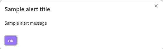
Confirm
Section titled “Confirm”import { confirm } from '@mnaoumov/obsidian-lib/modals/confirm';
await confirm({ app, message: 'Sample confirm message', title: 'Sample confirm title'});
Prompt
Section titled “Prompt”import { prompt } from '@mnaoumov/obsidian-lib/modals/prompt';import type { MaybeReturn } from '@mnaoumov/typescript-lib/type';
await prompt({ app, defaultValue: 'Sample prompt default value', title: 'Sample prompt title', valueValidator(value: string): MaybeReturn<string> { if (value.length < 30) { return 'Value must be at least 30 characters long'; } }});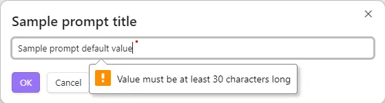
Select Item
Section titled “Select Item”import { selectItem } from '@mnaoumov/obsidian-lib/modals/select-item';
await selectItem({ app, items: ['Item 1', 'Item 2', 'Item 3'], itemTextFunction(item: string): string { return item; }, placeholder: 'Sample select item placeholder'});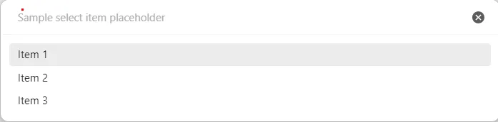
Select Option
Section titled “Select Option”Unlike Select Item (a fuzzy-search picker over an arbitrary list), selectOption renders one button per option — useful for a small, fixed set of mutually-exclusive choices where each choice has its own label and resolved value. One option can be marked as the call-to-action (primary) button. It resolves with the chosen value, or null if the modal is dismissed without a choice.
import { selectOption } from '@mnaoumov/obsidian-lib/modals/select-option';
const chosen = await selectOption({  app,  message: 'Sample select option message',  options: [    { isCta: true, text: 'Yes', value: 'yes' },    { text: 'No', value: 'no' },    { text: 'Cancel', value: null }  ],  title: 'Sample select option title'});