Modals
Obsidian Dev Utils provides some modals that you can use in your plugin.
In order for models to look properly, their styles have to be initialized. See Styling for more details.
import { alert } from 'obsidian-dev-utils/obsidian/modal/alert';
await prompt({  app,  message: 'Sample alert message',  title: 'Sample alert title'});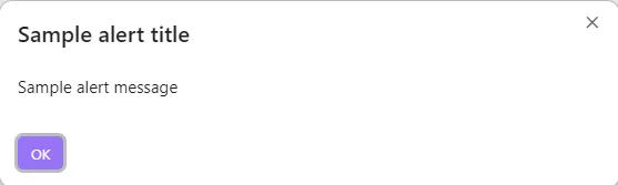
Confirm
Section titled “Confirm”import { confirm } from 'obsidian-dev-utils/obsidian/modal/confirm';
await confirm({ app, message: 'Sample confirm message', title: 'Sample confirm title'});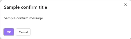
Prompt
Section titled “Prompt”import { prompt } from 'obsidian-dev-utils/obsidian/modal/prompt';import { MaybeReturn } from 'obsidian-dev-utils/type';
await prompt({ app, message: 'Sample prompt message', title: 'Sample prompt title', valueValidator(value: string): MaybeReturn<string> { if (value.length<30>) { return 'Value must be at least 30 characters long'; } }});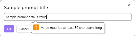
Select Item
Section titled “Select Item”import { selectItem } from 'obsidian-dev-utils/obsidian/modal/select-item';
await selectItem({ app, items: ['Item 1', 'Item 2', 'Item 3'], itemTextFunc(item: string): string { return item; }, placeholder: 'Sample select item placeholder'});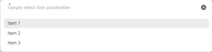
Select Option
Section titled “Select Option”Unlike Select Item (a fuzzy-search picker over an arbitrary list), selectOption renders one button per option — useful for a small, fixed set of mutually-exclusive choices where each choice has its own label and resolved value. One option can be marked as the call-to-action (primary) button. It resolves with the chosen value, or null if the modal is dismissed without a choice.
import { selectOption } from 'obsidian-dev-utils/obsidian/modals/select-option';
const chosen = await selectOption({  app,  message: 'Sample select option message',  options: [    { isCta: true, text: 'Yes', value: 'yes' },    { text: 'No', value: 'no' },    { text: 'Cancel', value: null }  ],  title: 'Sample select option title'});